
Branding
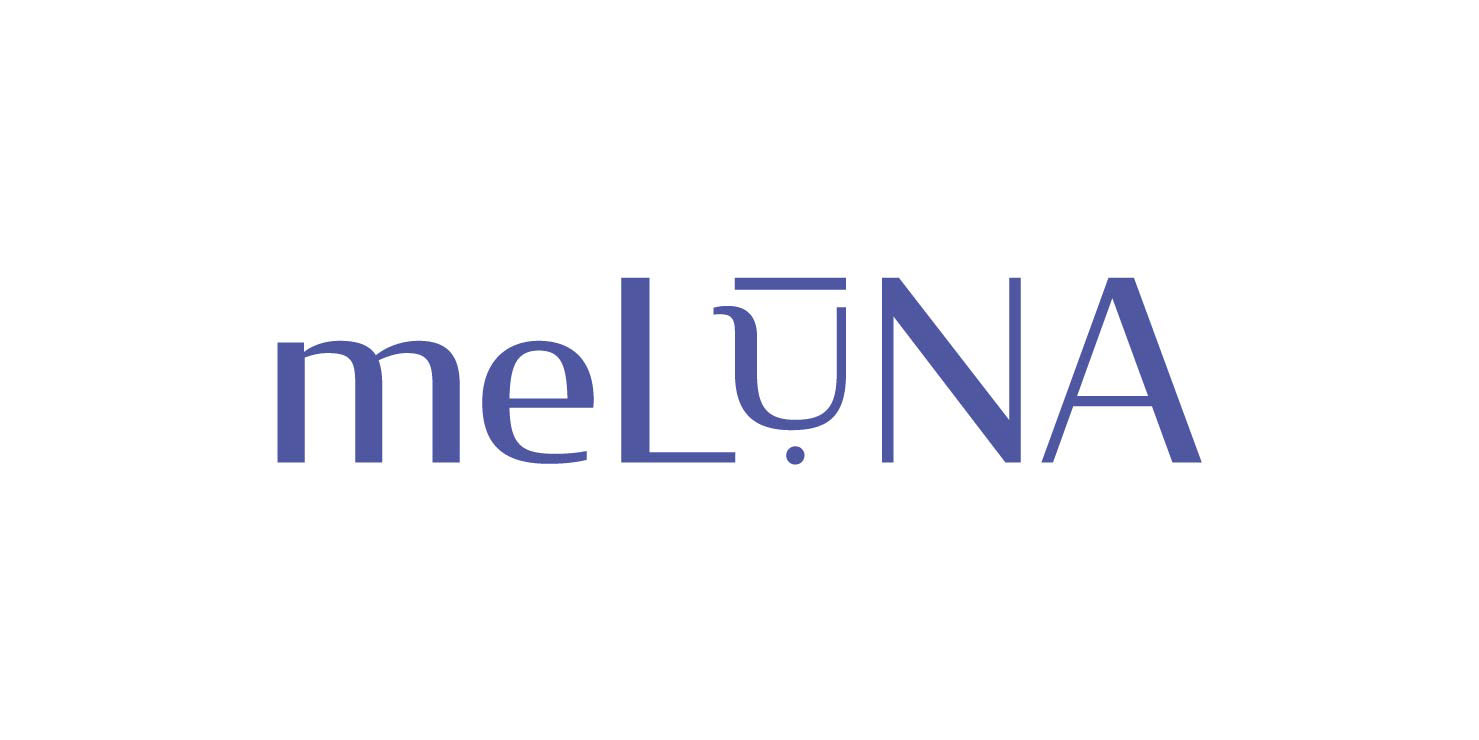
meLUNA
Me Luna ist eine Brand, die sich auf nachhaltige Menstruationsprodukte, dabei vorwiegend Menstruationstassen spezialisiert hat. In ihrem Onlineshop vertreiben sie ihre Produkte weltweit. Dieses Rebranding für die nachhaltigen Brand "Me Luna" schafft einen neuen symbolischen Wiedererkennungswert und kommuniziert die Kernwerte, mit denen sich die Konsumenten der Marke identifizieren.
Me Luna is a brand that specializes in sustainable menstrual products, mainly menstrual cups. In their online shop, they sell their products worldwide. This rebranding for the sustainable brand "Me Luna" creates a new symbolic recognition value and communicates the core values with which the consumers of the brand identify themselves.

Symbolcharakter
symbol
Das Logo bestehend aus Wort- und Bildmarke hat durch seine Einfachheit eine hohe Symbolkraft. Der Strich (Makron) und der Punkt (Igbo) über dem "U" geben sowohl Aufschluss über die Betonung des Wortes als auch dessen Herkunft. Es zeigt außerdem eine abstrahierte Menstruationstasse. Dreht man das "u" erkennt man die Silhouette eines Menschen, was wiederum Aufschluss über die Vielfältigkeit und die Zielgruppe gibt.
The logo consisting of a word a and a figurative mark, has a high symbolic power due to its simplicity. The dash (macron) and dot (Igbo) above the "U" indicates both - the stress of the word and its origin. It also shows an abstract menstrual cup. If you turn the "u" you can see the silhouette of a person, which in turn gives information about the diversity and the target group.
Farben
colors
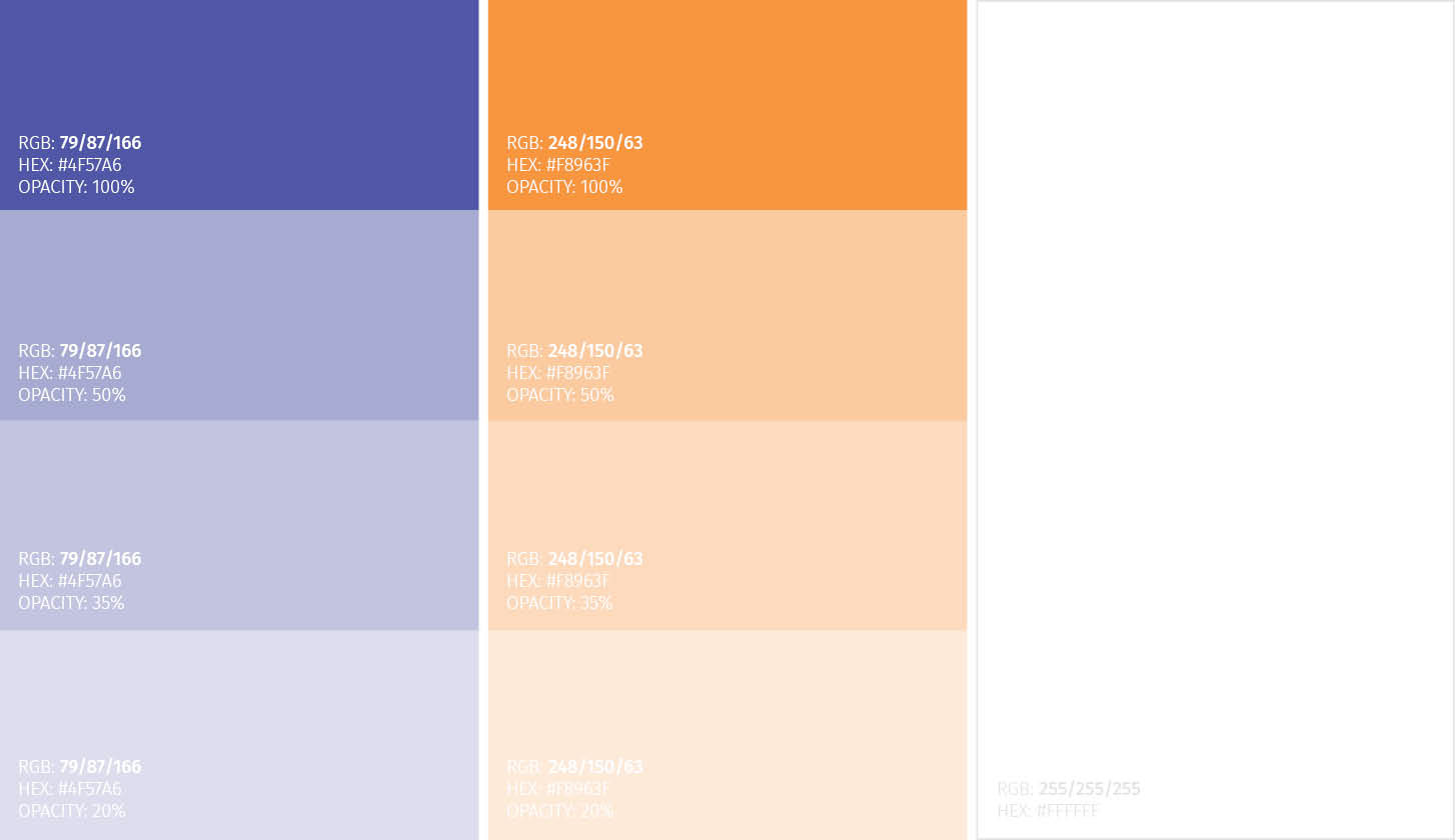
Für das Branding haben wir folgende Farben ausgewählt. Blau steht für Hygiene, strahlt Gelassenheit und Ruhe aus und sorgt so für weniger Stress. Violett wird eine schmerzstillende Wirkung zugesprochen. Orange hingegen repräsentiert vitale Stärke und Aktivität. Sie wirkt aufbauend, kräftigend, positiv und in jeder Weise gesundheitsfördernd.
We have chosen the following colors for the branding. Blue represents hygiene, radiates serenity and calm and thus ensures less stress. Violet is said to have an analgesic effect. Orange, on the other hand, represents vital strength and activity. It has a constructive, strengthening, positive and health-promoting effect in every way.
Produktverpackung
packaging
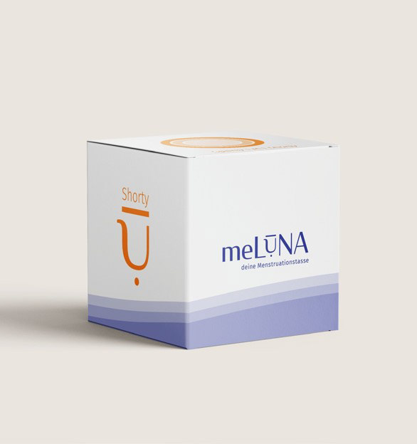
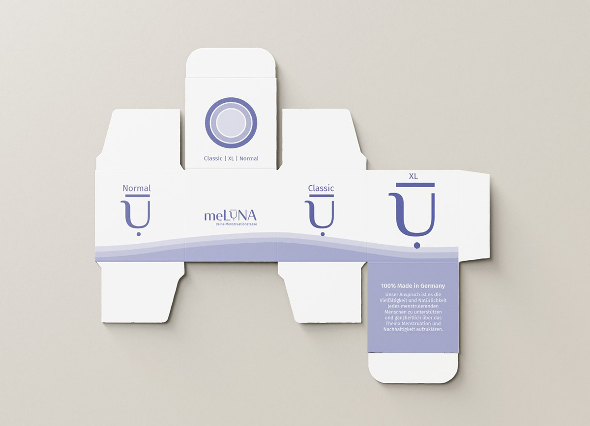
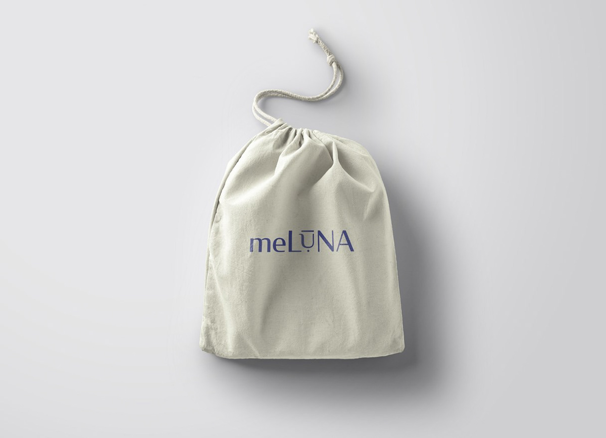
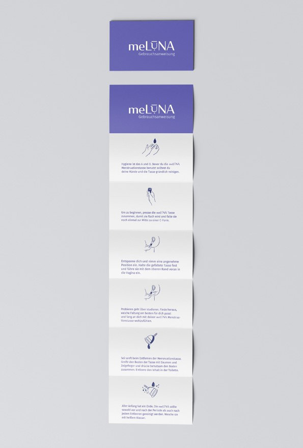
Für die Produktverpackung der einzelnen Tassen, haben die Plastikverpackung durch einen minimalistische Kartonverpackung ersetzt. Auf den Seiten sieht man die jeweiligen Tasseneigenschaften, die oben auf dem Deckel zusammengefasst werden, um sich im Einzelhandel auf einen Blick entscheiden zu können. Die bestellte Tasse wird geliefert in einem kleinen Baumwollsäckchen und kommt mit einer Gebrauchsanweisung für sowohl das Einführen der Tasse als auch die Reinigung und Pflege dieser.
For the product packaging of each cup, we have replaced the plastic packaging with a minimalist cardboard packaging. On the sides you can see the individual cup characteristics, which are summarized on top of the packaging for at-a-glance decision-making in retail. The ordered cup is delivered in a small cotton bag and comes with instructions for inserting the cup and cleansing.
Projektinformationen
projectinformation
Datum: Wintersemester 2021/2022
Hochschule: Münster School of Design
Professor*in: Prof. Dipl.-Des. Gisela Grosse
Mitwirkende: Evelyn Köping & Olivia Thomas
University: Münster School of Design
professor: Prof. Dipl.-Des. Gisela Grosse
contributors: Evelyn Köping & Olivia Thomas